Client project · B2B payroll
PayRun
A B2B platform that lets a CPA review and run payroll across many client businesses, from pay stubs to quarterly tax filings. Own the product design, information architecture, and interaction design; an engineering partner builds the platform.
- Role
- Product designer (discovery to UI)
- Platform
- Web app (desktop-first), mobile views in design
- Tools
- Figma, stakeholder interviews, service blueprints
- Timeline
- 2026 – In progress
Problem
What does the CPA need?
Our user is a CPA who runs payroll for many small businesses. Everything arrives by email and phone call, and the numbers get typed into an aging desktop tool. He tried the big platforms, and his reasons for leaving kept coming back to three things:
- Scattered. No single view of where every client stands.
- Crowded. Wide tables that are hard to read at a glance, and page after page just to add one employee.
- Wrong user. Built for one business owner running their own payroll, not a CPA managing many.
Solution
Two design goals
Clear hierarchy. Everything he needs on one screen, with the most important thing read first.
Follow the CPA’s mental model. When he talks through his week, it is always which client first, then which employee, then which period. So PayRun is organized the same way: client → employee → pay period.
User journey
The mental model of a CPA
He does not think in payrolls. He thinks in clients, then the people inside them, then the paperwork that follows. Every working session starts with the same three questions.
- Which client do I need to work on today?
- Which employee needs the payroll?
- Which reports do I need to create?
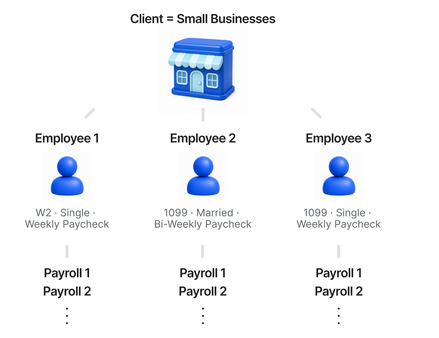
Underneath those questions sits the structure the product has to carry. One client is a small business with several employees, each on a different arrangement, W2 or 1099, filing status, weekly or bi-weekly, and each of those employees accumulates payroll after payroll.
Core use case · Clients list
Clients tab
The CPA’s day starts with a client, so the Clients tab is the front door. It is not a directory. It opens on an overview: how many clients are active, how many payrolls are due in the next few days, and which of them need attention first.
Runs this week sits at the top as a status view: what is coming, what is still open, and what is already done, across the whole practice. The word run is his, not ours. Payroll people talk about running payroll, so using the same word keeps the interface in the language he already thinks in.

Core use case · Client
Step inside a client
One click deep, everything about one business sits in one place: company details, the employee roster, and the runs. Before PayRun that meant searching months of email threads, so nothing about a client lives anywhere else now.
The page leads with the most recent payrolls, within immediate reach at the top, since the last run is what he checks against when he starts the next one. The company overview and the full roster sit right below.

Core use case · An employee
Reviewing one employee
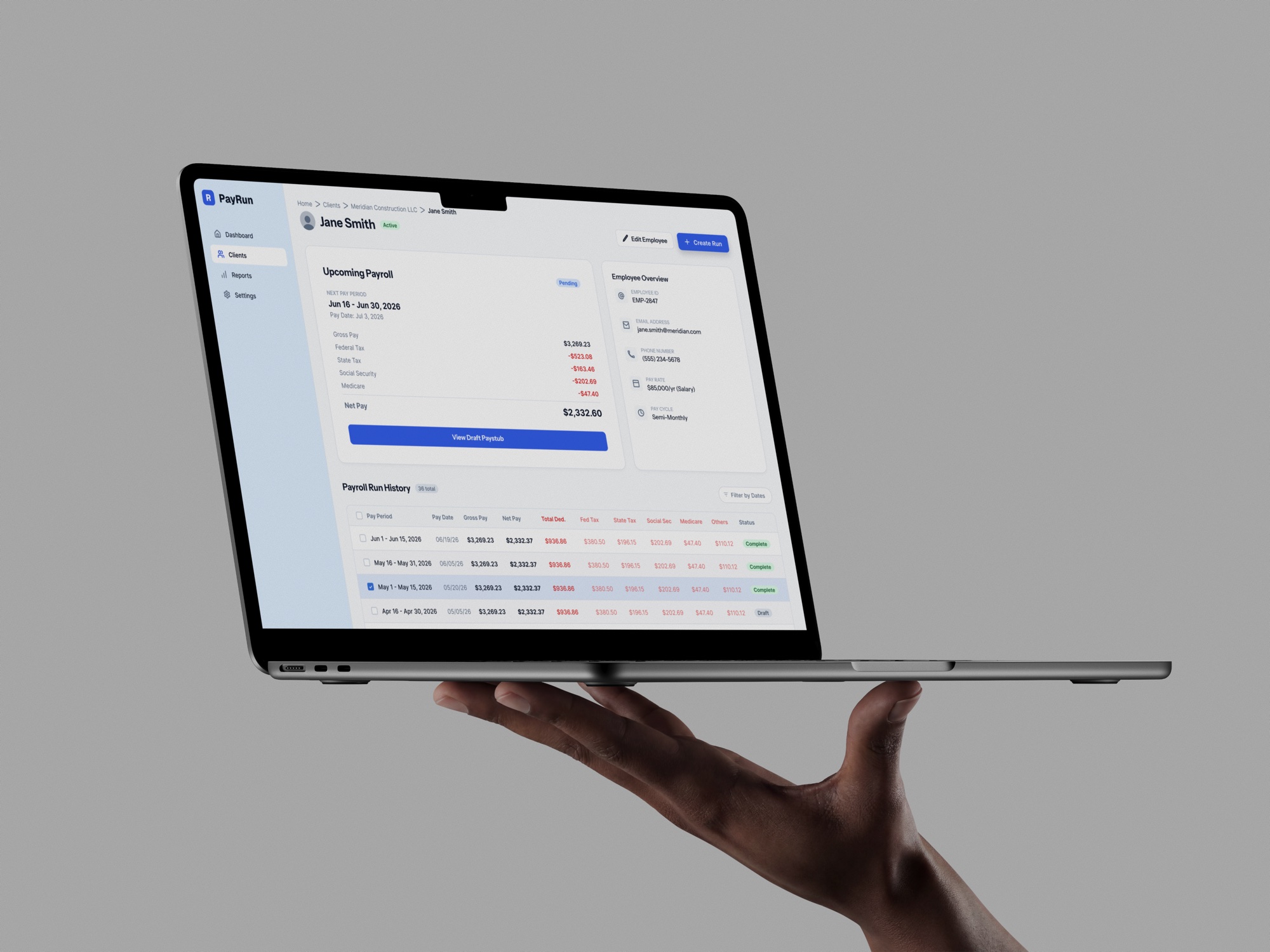
This page carries a lot, so the work was hierarchy rather than subtraction. The payroll detail leads, because reviewing the numbers is the job. The employee overview sits beside it so he can confirm he is looking at the right person on the right terms before he trusts the math. Underneath, the run history and year-to-date totals build the record.
Every deduction is listed out, at the CPA’s request. He needs to see federal, state, Social Security, Medicare, and the rest itemized rather than summarized, so the goal was dense but legible, not less information.

Core use case · Creating a run
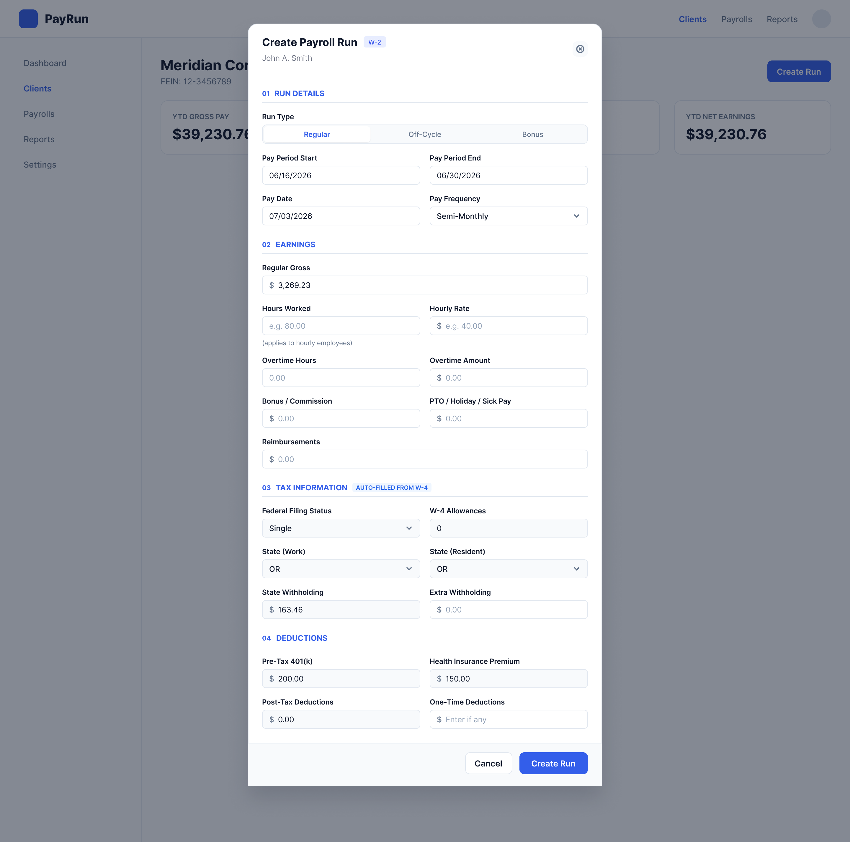
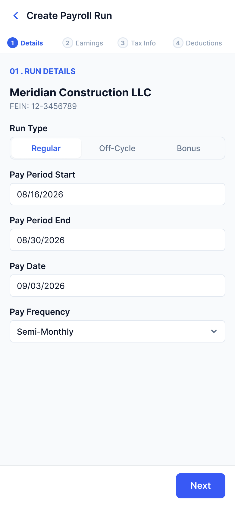
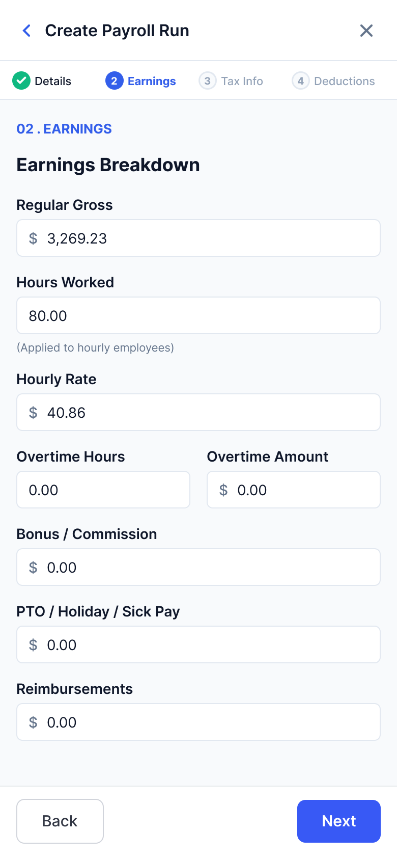
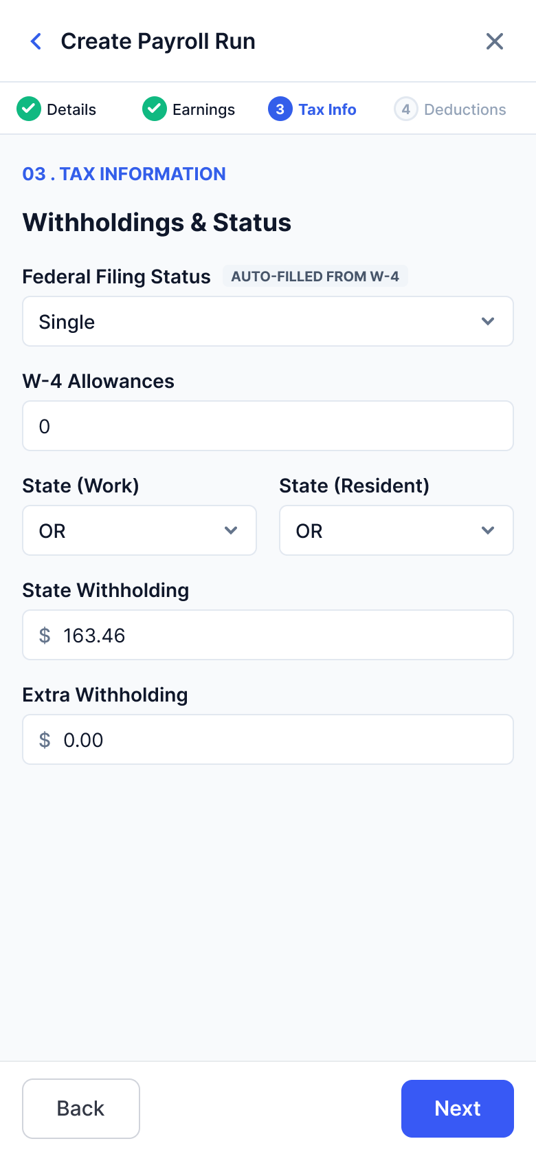
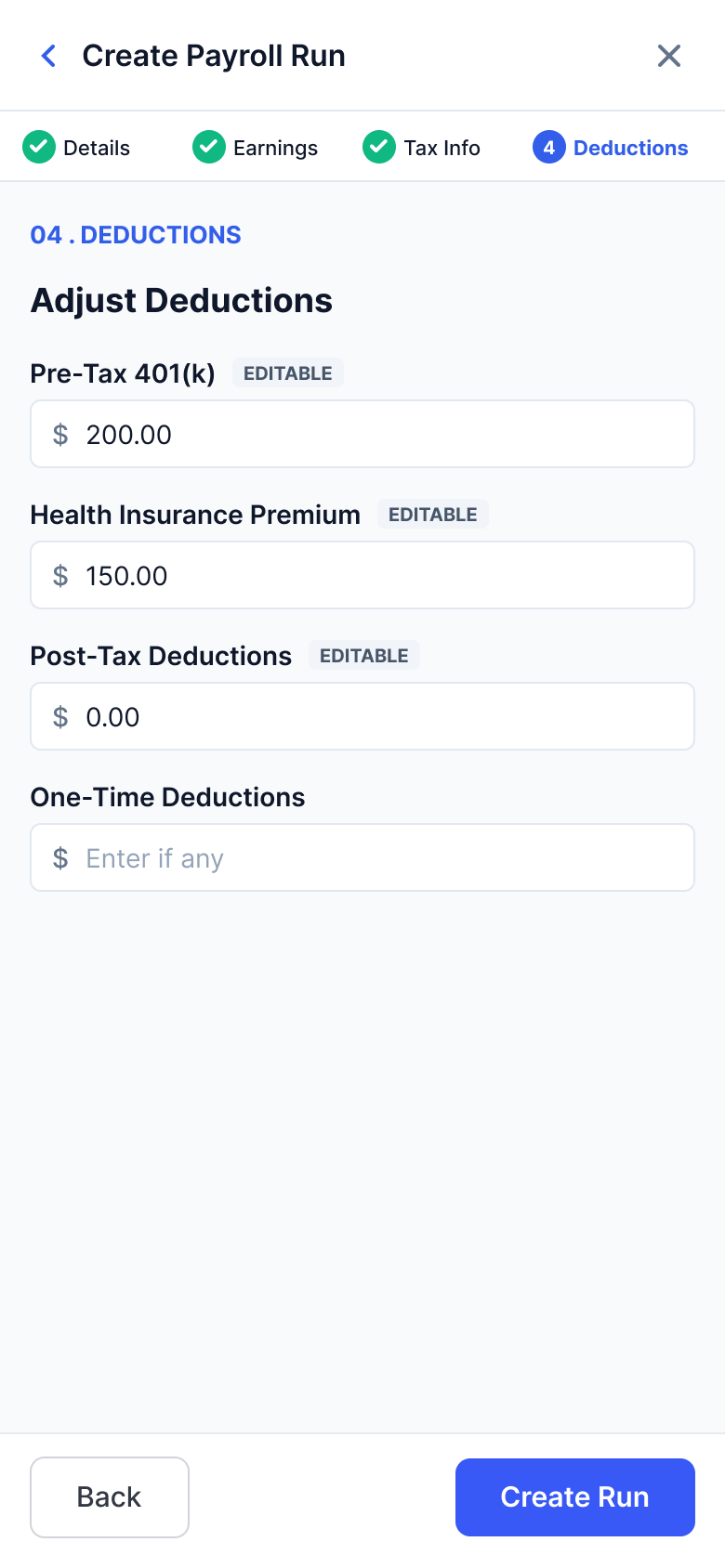
Creating a payroll: one form on a desktop, four steps on a phone
On desktop the whole form sits in one modal, with tax fields pre-filled from the W-4, so most of it is confirming, not typing. On a phone the same form becomes four steps with a stepper. Same data, same order, different pacing.
Design decision 1
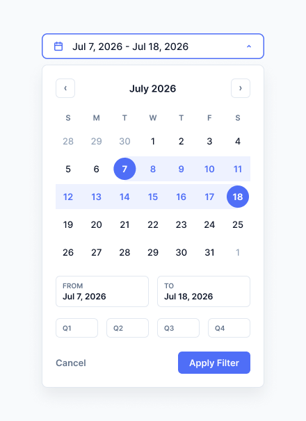
Quarterly rhythm
The filter started as a custom date range, which covered every case in theory. In practice the CPA does not work in arbitrary ranges. His year runs in quarters, so the quarters became presets sitting next to the custom range.
Design decision 2
Filings: his mental model, plus a batch view
Filings are papers that go out to the IRS and the states, so I expected him to think in forms and deadlines. I was wrong. He still starts from the client.
So the page carries both. By Client groups filings the way he actually works, and List sorts everything by due date for the days when he is filing in bulk. The correction is the useful part: I had a reasonable theory about a regulated workflow, and one walkthrough with the person doing the work replaced it.


Working with AI
AI runs through the whole process on this project, not just the output. I use it to pressure-test the product definition before anything gets drawn, to widen the set of options while brainstorming, to build and revise screens in Figma, and to move through iterations faster than I could by hand.
Critique is one part of that. Running a structured review against my own screens catches what I stop seeing after hours in the same file: inconsistent data, hierarchy that drifts, states I never designed. It does not replace the CPA’s feedback, but it raises the floor before his time gets spent.
Phases
Where it stands
PayRun is a work in progress, tested hands-on with the CPA it’s designed for. It’s scoped in three phases:
- Phase 1 (in progress). The core tool for one CPA to run payroll across all of his clients.
- Phase 2. Clients enter their own employee and hours data instead of emailing it.
- Phase 3. A product other CPAs can run their practices on.